|
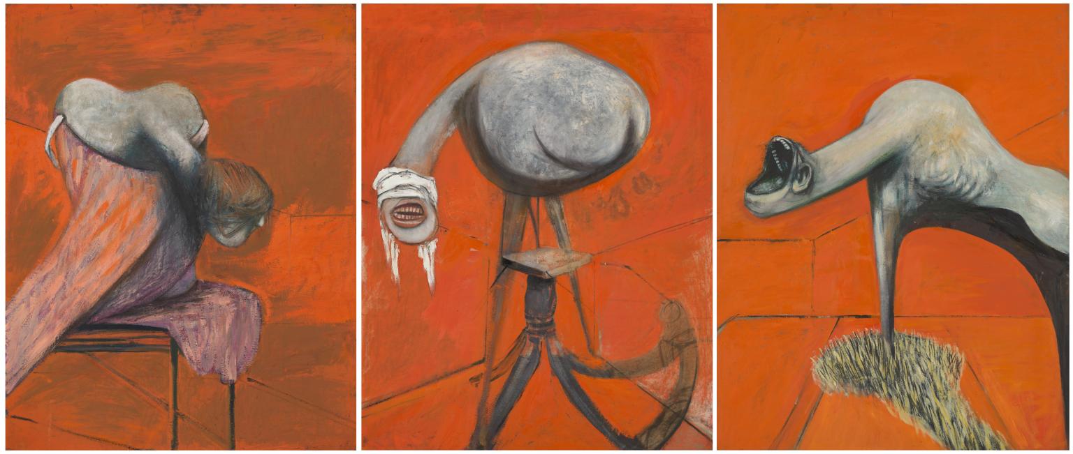
Francis Bacon achieved financial and critical success early in his career and never looked back. Until relatively recently John Berger was one of the few major critics who did not regard Bacon highly, in contrast to the adulation heaped upon him by David Sylvester, for example. I have a dim recollection of seeing Bacon’s ’Three Studies for Figures at the Base of a Crucifixion’ (1944) in my teens, but the first encounter that made a lasting impression was a show at the Marlborough Gallery in the mid-1960s. Unlike most galleries today, the space was carpeted (deep red, I think) and had the atmosphere of the lobby of a luxury hotel. The paintings, behind glass and contained in thick gold frames were clearly luxury objects, and Bacon’s technique of placing his images on flat areas of colour laid onto unprimed canvas reminded me (and still does) of those paintings on velvet of sad, wide-eyed children, complete with highlights in the eyes. Maybe I was too young to respond, but I felt none of the claimed horror or alienation. Many artists (including myself) are tempted to smudge and blur to compensate for unconvincing drawing; but Bacon built his whole style on it. Yes, there is interest in the paint handling, but after a while it becomes too predictable, too pat. And why is it only the figures are tortured and distorted, while the space surrounding them is relatively calm and naturalistic? (In fact, the same could also be said of many works by Picasso.) Only a few drawings by Bacon have been found; his friend Lucian Freud, although apparently an admirer of Bacon’s work, said bluntly that he couldn’t draw. I went to a fairly comprehensive Bacon show in Tokyo last year, and although I tried to keep an open mind, the only paintings that really convinced me were the earliest: ’Three Studies for Figures at the Base of a Crucifixion’. In those three paintings there was a genuine attempt to discover something. But once he had found that patented Bacon technique, he was parodying himself.
0 Comments
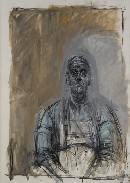
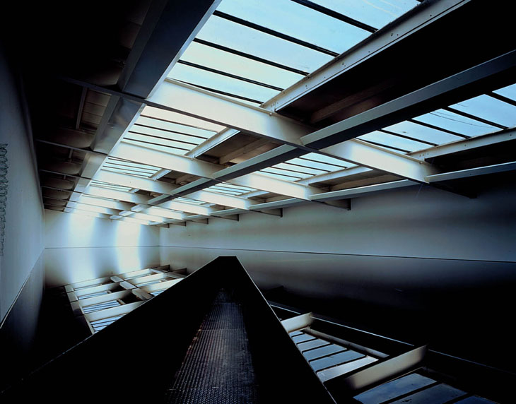
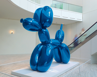
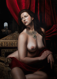
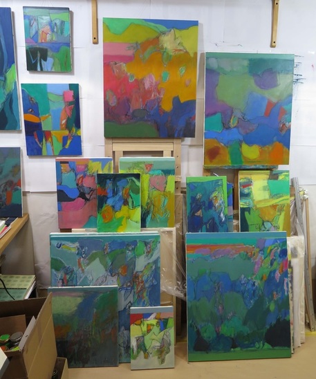
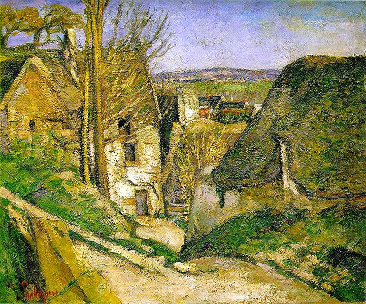
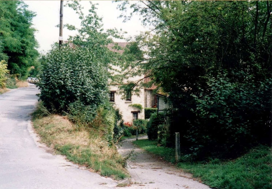
Some art critics appear to enjoy writing about artists who, as they see it, have failed. John Berger was fond of this kind of thing at one time; a whole book was devoted to ’The Failure of Picasso’, and his collection of writings ‘Permanent Red’ contained a chapter titled ‘Artists Defeated by the Difficulties’ (Naom Gabo, Paul Klee, Jackson Pollock, Dubuffet, Germaine Richier, Barbara Hepworth, John Bratby). The reputations of some of these artists have diminished since the 1950s and 60s, which could be a sign that they did ‘fail’. But what does it mean to fail? For Berger it often meant not being able to satisfy his desire for an art that was of high artistic quality, but at the same time spoke to the ordinary working man (or woman). But the inability to reach an unattainable goal in which formal and social considerations are balanced to the critic’s satisfaction cannot be considered failure. We can find many examples of artists who themselves admit that they have failed, and their words are usually more informative than those of the critics. Cézanne, Hokusai, and Giacometti (“All I can do will only ever be a faint image of what I see and my success will always be less than my failure or perhaps equal to the failure.”) are examples of artists who felt they had not achieved what they wanted. According to their own words, failure for a painter usually means an inability to realise a formal goal. I have never read of an artist who believed that he or she had failed to sufficiently move the public. Most artists of any note, whether we like it or not, reject the idea of working with public approval in mind. The main attraction of painting for me is that it presents the viewer with a flat surface (the picture plane) which at the same time can give an illusion of depth, from shallow to infinitely deep. In fact, the depth can extend forwards from the picture plane, and well as recede away behind it. By depth, I don’t mean representing illusionistic depth by depicting forms with shadows and highlights, but achieving depth or projection through the use of colour; Hans Hofmann's 'push and pull'. And that is probably the reason why I respond less enthusiastically to sculpture or installation art. For me, a sculpture is always a real object in the viewer’s immediate space. It rarely suggests space beyond itself, although some exceptions might be sculptures by Anthony Caro and Anish Kapoor. As for installations, the only one that has ever excited me was Richard Wilson’s “20:50” (above), a sea of used sump oil, permanently on view at the Saatchi Gallery in London. The experience of walking into the middle of the piece is something I will never forget. What does it mean? Who knows. I’ve been interested lately in the growing media presence of the ‘representational art (RA)’ movement. It seems to reflect the widely-held dissatisfaction with the elitist ‘art world’, represented by powerful gallery owners, mega-rich collectors, and artists such as Jeff Koons and Damien Hirst. The re-emergence of figurative art (in fact, it’s always been around) has coincided with (or is a part of) the rise of conservatism and nationalism around the world. It can be seen as a desire to return to ’traditional values’ and a rejection of subjectivity and relativism, principles that defined art of the modern and post-modern eras. There is no shortage of videos on YouTube in the form of RA artist profiles, instructional videos, workshops, and panel discussions, and it becomes clear that the term ‘representational art’ is virtually meaningless, as it apparently includes the worst kind of kitsch (Eric Armusik, above right), the paintings of oddballs (Odd Nerdrum), RAs with a foot in the post-spot-modern art world (Vincent Desiderio), and undoubtedly important artists such as Jose Luis Garcia-Lopez. And there can be no doubt that the works of Lucian Freud, Alice Neel, or Chuck Close are representational, but when we listen to RA proponents, their work is rarely, if ever, mentioned. In fact, for the committed RA supporter, ‘representational’ often means art that echoes the paintings of such artists as Rembrandt, and Caravaggio. Deep shadows, overall gloom, and highlights are treasured as marks of quality. Heroic poses add gravitas. Unabashed sentiment is celebrated. Another resurrected hero of the movement is the quintessential French academician, William-Adolphe Bouguereau, and an example of a school that follows the French academic tradition to the letter is The Academy of Realist Art , which has branches in Boston, Edinburgh and other cities. An article on the Huffington Post website profiles The European Museum of Modern Art, opened in 2005 in Barcelona and a major promoter of the new representational art. The museum is housed in a refurbished palace in which Putin or Trump would feel right at home. In Japan, there is the Hoki Museum, mainly dedicated to Japanese artists of the RA genre. So what are my objections to the RA phenomenon? In its extreme form, it is an attempt to return to the past, akin to Trump’s promise to ‘make America great again’. The belief that a return to the principles of the 19th century French academy will lead to any worthwhile art is absurd. I have no quarrel with representational art that sincerely addresses present-day issues, using a contemporary idiom, but to imagine that we still need dimly-lit pictures of heroic nudes or elegant decanters of wine is laughable. Am I defending the world of Koons and Hirst and white-cube galleries? Definitely not; I find both extremes profoundly depressing. Surely, as in politics, there must be a sane, broad-minded middle ground. To be continued … I sometimes start a painting from ‘nothing’, making a network of lines and areas of colour. The level of control can vary, but usually less control leads to a greater chance of a stimulating and unexpected starting point. It can help to close my eyes at this stage. In fact, these ‘random’ marks are no less random than the forms that present themselves to us in the real world. At a certain stage, there is always a desire to tease out and make concrete forms which may or may not relate to recognisable features of the everyday world. Relationships across the picture plane and in depth suggest themselves, and ideally, colour and formal relationships will develop together. The forms I see may relate to previous paintings and drawings, or to something I have seen in my everyday life. Sometimes the forms and overall image appear too easily and must be discarded. At times, there may appear to be no way of taking the painting forward, and turning it sideways or upside down, working on another painting, or just leaving it alone for a day or so can help. If I feel I'm moving in the right direction, each successive move becomes more assured. There comes a stage when progress slows, and each subsequent step requires greater deliberation. This is often a signal that the painting may be finished, or nearly so. ‘Finished’ meaning that work on it has ceased, rather than a particular goal has been reached. There is always a danger of continuing past this point and losing whatever it is that was gained. Ideally, one ends up with a painting that is nothing like the original concept. It should convince me and the viewer that it has a right to occupy a place in the world. And if I'm lucky, I might come up with a suitable title. 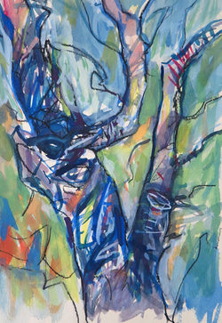 In September, I made a lot of drawings of the Neolithic stone (menhir) alignments and surrounding landscape at Carnac in Brittany. I had plans of returning home and making a series of paintings relating explicitly to the drawings, but so far their influence on recent oil paintings has been indirect, affecting forms, lines, and textures. But I have done a number of watercolour and gouache paintings closely based on the drawings and this is one example in which the forms provide a framework for a free exploration of colour. In 2006 I visited Auvers, a short train ride from Paris. It hasn't changed much since the late 19th century, and you can still find views painted by van Gogh and Cézanne. The photo shows the view Cézanne painted in 'The House of the Hanged Man' of 1873. It was a transitional work that had always had a special mystery for me, probably because of the title. It was strange to see that the house was now a respectable middle-class residence. ("House of the Hanged Man" is licensed under CC BY 2.0)
(reposted from December 2104)
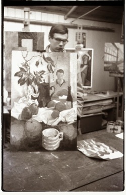
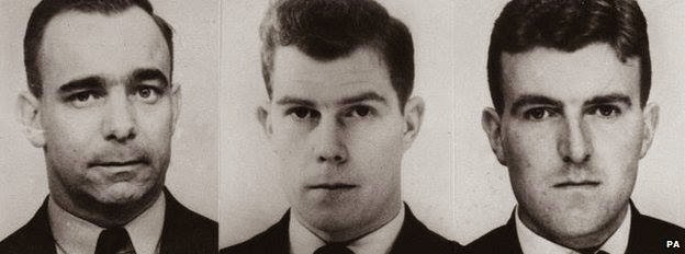
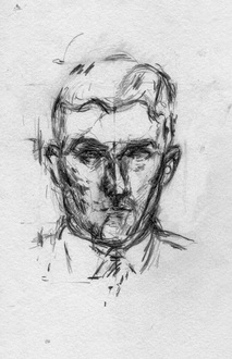
I recently read that Harry Roberts, who murdered three police officers in 1966, had been released from prison. The story on the BBC website included photos of the three victims. I found the faces mesmerizing and downloaded the images with the idea of doing some drawings or even a painting from them. The more I looked at the face of the policeman on the right, the more familiar it seemed. Then I realized it reminded me of a drawing I had in a portfolio of my old work. I managed to find it, and yes, I'd made the drawing from the same photograph, 48 years ago. 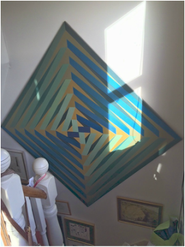 (originally posted in March 2015) A real pleasure to receive Tony Rushton's reply to my email sent care of Private Eye: "Not only do I have ‘Quiet’ finally hung at home - sadly not on a blank white wall - but I also have the ’66 Whitechapel catalogue. Both of us have no doubt aged but I still find the painting very peaceful and eloquently sophisticated." His wife Annie added a few lines and kindly attached images of 'Quiet' in its new home, including the one below. She later sent me a more frontal version which has replaced the black and white image on my 'Earlier work' page. It was interesting to see this painting in colour again after so many years. |
 RSS Feed